arcade / webdev
Analytics dashboard
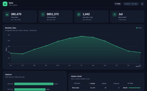
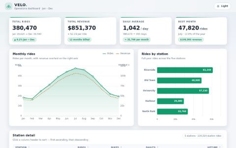
KPI tiles, two hand-drawn charts, a sortable table and a theme toggle — from a fixed dataset, so every model is drawing the same numbers.
The prompt every model was given
Build a single-page analytics dashboard for **Velo**, a fictional bike-sharing service.
Everything renders from `index.html`; you may split into `style.css` and `app.js`.

## The data

Hard-code exactly this in the page. Do not fetch anything, and do not invent different numbers.

```js
const monthlyRides = [
  { month: "Jan", rides: 18420, revenue: 41320 }, { month: "Feb", rides: 17110, revenue: 38900 },
  { month: "Mar", rides: 24880, revenue: 55100 }, { month: "Apr", rides: 31240, revenue: 69800 },
  { month: "May", rides: 38970, revenue: 87200 }, { month: "Jun", rides: 44310, revenue: 99450 },
  { month: "Jul", rides: 47820, revenue: 106900 }, { month: "Aug", rides: 46150, revenue: 103200 },
  { month: "Sep", rides: 39680, revenue: 88700 }, { month: "Oct", rides: 30240, revenue: 67600 },
  { month: "Nov", rides: 22090, revenue: 49400 }, { month: "Dec", rides: 19560, revenue: 43800 },
];
const stations = [
  { name: "Riverside",   rides: 61240, bikes: 42, faults: 3,  uptime: 0.982 },
  { name: "Old Town",    rides: 48930, bikes: 30, faults: 7,  uptime: 0.941 },
  { name: "University",  rides: 57110, bikes: 38, faults: 2,  uptime: 0.991 },
  { name: "Harbour",     rides: 29480, bikes: 24, faults: 11, uptime: 0.897 },
  { name: "North Park",  rides: 33760, bikes: 28, faults: 5,  uptime: 0.963 },
];
```

## What the dashboard must contain

1. **Four KPI tiles** across the top: total rides for the year, total revenue, average rides per
   day (use 365 days), and the best month by rides. Each shows the number formatted for humans
   and a short label.
2. **A line or area chart** of monthly rides across the twelve months, with labelled axes.
3. **A bar chart** comparing rides per station.
4. **A table** of the five stations with all their columns, sortable by clicking a column
   header — ascending, then descending, with the active sort visibly indicated.
5. **A light/dark theme toggle** that switches the whole dashboard and remembers the choice in
   `localStorage` across reloads.

## Requirements

- **Draw the charts yourself** with canvas or SVG. No charting library — you have no network.
- Both charts need axis labels and enough gridlines or ticks to read a value off them.
- Hovering a data point or bar shows its exact value.
- The layout must hold together at 1280px wide and stack sensibly below 700px.
- Both themes must be readable: no light-theme text left at a dark-theme colour, and charts
  must re-render or restyle to match the active theme.

Pick the visual style yourself, but make it look like a product someone ships.
Side by side 2 results
Same prompt, same harness settings, one model each. Open one to play it.
not generated yet: qwen3.6-27b, qwen3.6-27b-q6, gemma-4-31b, gemma-4-12b, gemma-4-26b-a4b, qwen3.6-35b-a3b, bielik-11b-v3, qwen3.5-122b-a10b, muse-glimmer-30b, nemotron-3.5-lightning-30b-a3b, qwen3.8-flash-next